 Buy me a hot chocolate
My Thoughts on macOS Big Sur's New Design
July 9th 2020Before I start let me point to a great article I found while looking into this topic from Andrew Denty
The Icons & The Dock

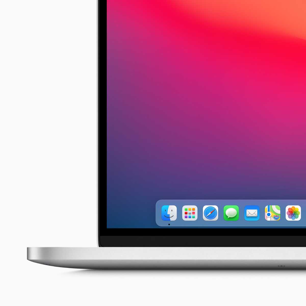
The icons for macOS applications are taking some cues from its iOS relatives by introducing rounded square icons. I personally like this change as it makes the icons in dock uniform in shape and size.
The icons also bring depth to icon design, not that it every really left the macOS design language, and I am hopeful that sense of depth for the icon design finds its way back to iOS. I am not saying that we should bring back skeuomorphism, but I think that there is some middle ground that should be strived for.
The dock is now slightly floating away from the bottom edge of the screen, which is very iOS like. The docks corners are also rounder this time around to match the radius of the icons that sit in it, again this is similar to its iOS counterpart.
User Interface

Everything in macOS Big Sur is a little bit brighter and more colourful. For example the gray gradient application headers have mostly been replaced with a white application header which blends more with the content section of the app. The default wallpaper is also a bit of more of a departure from the last few releases of macOS as it is a abstract representation of a mountain range rather then a actual photo.
Default applications
The corner radius of ths applications windows has been increased. Visually the radius of the corners are closer to the radius of the corners of newer Macs. Giving everything slightly rounded corners makes things appear softer and more welcoming.
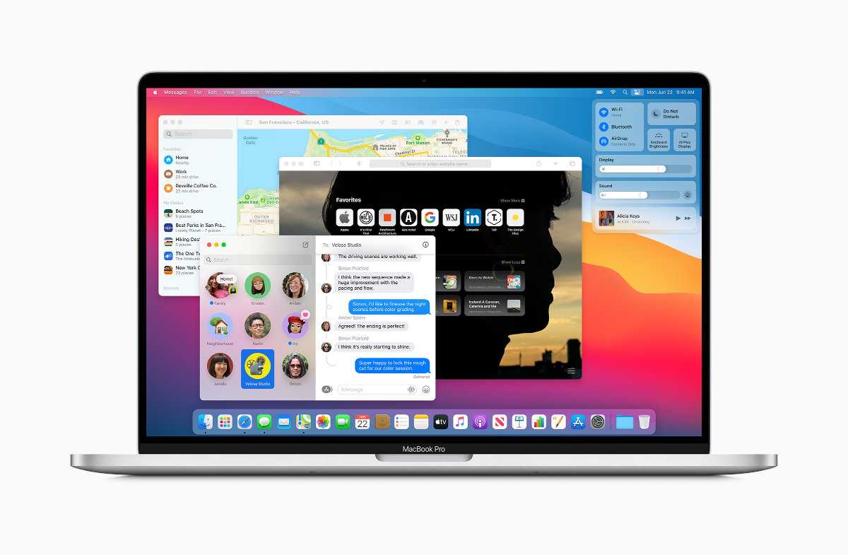
The default applications sidebars now visually take up the full height of the application and still have a blurred transparent background behind them. Visually extending the sidebars of the applications to fit the full height of the application window reduces the amount of hard corners in the applications. Reducing the hard edges makes the applications appear softer and for some, including myself, more pleasing to look at for a long time.
Menu Bar & Control Center
The menu bar of macOS Big Sur is slightly taller and is more translucent, which lets it blend in more with the desktop image that you are using. The corner radius of the pull down menus has increased and the space between each item has increased to help improve the readability and the accessibility of the items. I have always appreciated Apple's focus on accessibility and readability and these changes will help improve those areas for all users.
macOS Big Sur also cleans up the list of icons that show up on the right hand side of the menu bar by introducing Control Center to macOS. The control center on macOS Big Sur works similar to how it works on iOS. It includes settings like display, Bluetooth and AirDrop. You can also customize it by adding other options, such as accessibility and battery. Some of the options have sub options, for example clicking on the display setting will bring up other options related to display such as dark mode and night shift. I think this is a great and a much need improvement it moves some of the not regularly needed items from the menu bar into a place when they are still just one click away.
Notification Center
The biggest change for the notification center is the removal of the blurred background from the panel. I am not sure if I am the biggest fan of removing the blurred background as it gave it some separation between the panel and the content behind it.
The notification center now also groups notifications by message thread or app. This is a welcome change for me as my notifications list usually is just one long list of notifications from one app.
You can also choose the size of your widget which is a nice addition and will allow you to have two widgets side by side. Holding the mouse down on a widget will give you you more information for that widget or allow you to take an action, which is a nice way to add additional interactive to the widgets. I am interested to see what developers come up with for the new widgets.
Safari Customization

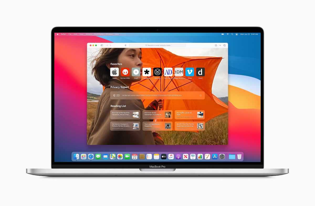
Apple is allowing more customization to some of their applications. In Safari they are allowing users to set a background image for their start page, something that other browsers have allowed for awhile now which is great to see.
Safari will also be adding support for the WebExtensions API, which is currently used by browsers such as Firefox, and closer to the way extensions are developed for Chrome. Apple is also releasing a migration tool to help bring extensions to Safari.
General Thoughts
Overall I like the changes that Apple is making in macOS. They are unifying the design language more and more between iOS and macOS with each major release.
With increasing the size of things like the menu bar and the space between menu items it leads me to wonder if they are working on a version of macOS for iPad. Now that newer Macs will be running or Apple silicon it would not surprise me if they are.

Buy me a Hot Chocolate
Usually people would ask to buy them a coffee to help support their site and content they provide, but I do not drink coffee so instead I will ask for you to buy me a hot chocolate.
All of the content on my blog is offered ad free, buying me a hot chocolate will make sure that it stays that way.
Buy me a hot chocolateAbout Adam Webster
